
Analytics - 3 Data Visualization Techniques
Okay, I might be biased, but let’s address a common misconception: visualization is just about making things look pretty. Over the last 10 years I've found visualization to be an increasingly important means for discovering insights, not simply making things look good.

As humans, we can take a great deal of complexity, offload it to the eyes and distill it into key points that drive action. Our innate ability to spot patterns in color, size and relationship – the sort of stuff that provided an evolutionary advantage foraging for food and shelter – helps us draw conclusions from increasingly complex datasets, and is addressed by visualization.
Since visualization enables us to interpret data more easily, our team of data scientists at Vistex begins each project with exploratory data analysis and visualization so we can help clients glean insights before deep-diving into further analytics. In this post I will share three basic matrix visualization techniques I use all the time. Each technique may inspire you to think differently about your channel data. Ready?
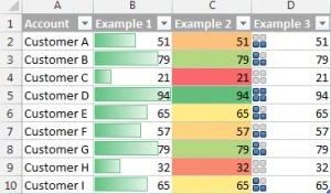
Technique 1: Columns and Rows alternatives – Conditional formatting to better highlight outliers.
Our lives are dominated by columns and rows, and the Microsoft Excel paradigm of workbooks with worksheets is an ever-present reminder of this. If you want to build a graph, Excel is likely your first (and last) stop. Whether you are aware of it or not, you often create disconnected graphs that fail to tell the entire story of the data. Maybe the best way to understand data is in the form of conditional formatting to add insights into rows and columns now. Here's how you do it:
In Excel select your table > Add conditional formatting > Data Bars…Color Scales…Icon Sets…and presto you get an idea of the number of important rows and the remaining ones that form your long-tail. Classic Pareto.
Technique 2: Ranked List alternatives – Revenue metrics
How do you find your best performing products, customers and partners? First, grab a list of your customers’ sales by quarter, pivot the quarters to columns with a pivot table, then in adjacent cells sum up all of their revenues. In Excel select your table > Insert > PivotTable…put Accounts on rows, Quarter on columns and Sales in Values.
Sort them from highest revenue to lowest, then from most frequent to least, and finally by most recent to least frequent. Instant Segmentation. Combine this with conditional formatting, and pause for effect:
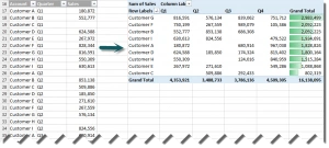
A similar technique can be applied to channel partners, products anything you need to value – pretty cool huh?
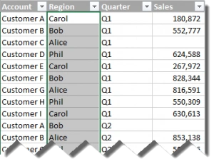
Technique 3: Bar charts – Part to whole relationships, simple comparisons to drive a big focus
You often have questions, such as “how did my Q4 sales this year compare to Q3 sales, by geography, Sales rep or anything else.” You can answer these questions by tagging your sales data with known values, say sales rep. like this:
Then you can create a pivot with those values.
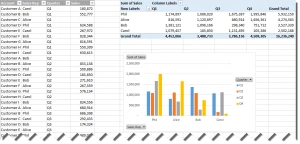
Now it’s clear who is my top sales rep. – it’s Phil by the way.
Okay, now it's your turn to give each of these columns and row techniques a shot and let me know how it goes.
If you missed our recent webinar Real World Analytics with Big Data: Trends, Best Practices and Insights, CLICK HERE to get your copy of the slide deck below for more insights into how analytics can help you improve channel program success.